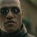
When people read memes, you have less than a second to get their attention. The easier it is to read, the better your chances are they will read it. Just changing the font shadow allows the text to be a bit more legible. Myself? I would have used the default yellow or green for the fill with the dark font shadow. I'm not criticizing the content, but the presentation. Some people will actually downvote memes that are difficult to read. That's one reason why you never see a Boardroom meme on the front page. The default font is terrible for the amount of space allotted.

 Caption this Meme