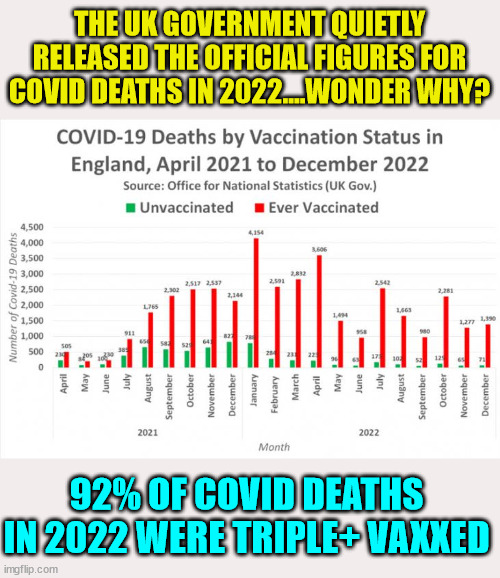
If i understand the graph correctly it is straight forward with providing actual numbers of deaths for both vaccinated and unvaccinated people.
January, for example:
4,154 vaccinated deaths
785 unvaccinated deaths
---------
4,939 total deaths of which 84.2% were vaccinated
92% over all seems legit judging by the disparity between the two metrics illustrated by the graph.
If I am incorrect, please show me my error.