Imgflip Logo Icon

A quality of life change. Its something very, very, small, ik.

A quality of life change. Its something very, very, small, ik. | Why do these buttons gotta be so damn close to each other on mobile? It takes one lag spike or calibration issue and your account is gone. Can you please either move the "delete account" button further down or move the "update" button to the top of the settings page? | made w/ Imgflip meme maker
463 views 36 upvotes Made by broken-vessel 2 months ago in imgflip
5 Comments
3 ups, 2mo
made w/ Imgflip meme maker
this would seem more reasonable
3 ups, 2mo,
1 reply
Is there no are you sure thing?
4 ups, 2mo
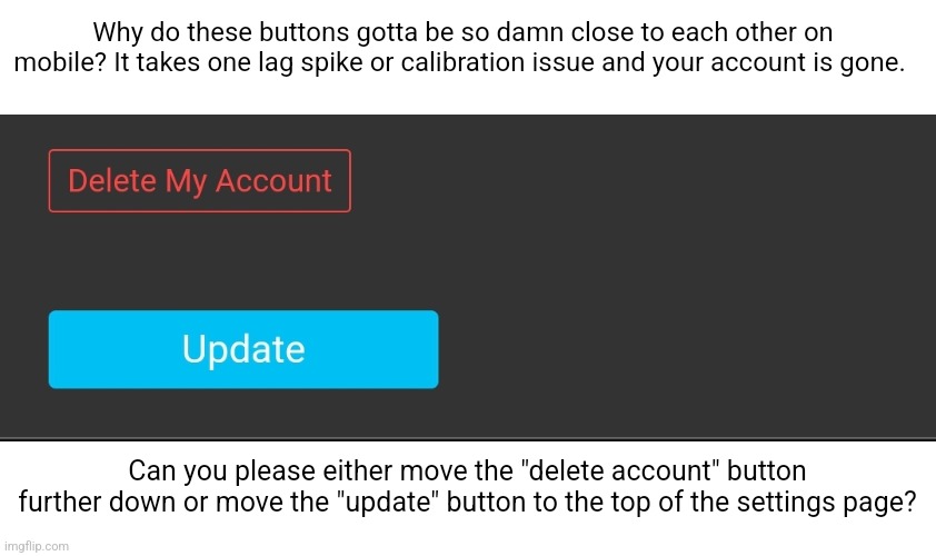
Even if there is, within itself, those buttons being so close to each other is just stupid

It would make more sense for the "update" button to be at the top anyways as 9 times outta 10 you're just changing your name then scrolling all the way down just to press that damn button (on mobile). Its a lot more convenient to just have it near the top anyways
1 up, 2mo
CAN THE IMGFLIP DEVS DO SMH RIGHT FOR ONCE!?!
[deleted]
0 ups, 2mo
real
Created with the Imgflip Meme Generator
IMAGE DESCRIPTION:
Why do these buttons gotta be so damn close to each other on mobile? It takes one lag spike or calibration issue and your account is gone. Can you please either move the "delete account" button further down or move the "update" button to the top of the settings page?